- Components
- Card
Components
Tailwind CSS Card
Use pre-built Tailwind CSS cards with various layouts and interactive UI components. Ideal for product and event listings, user profiles, dashboards, and more.
Example
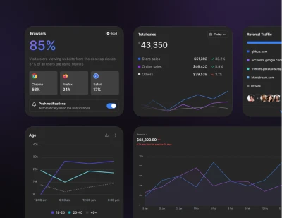
A basic card containing a title, content and an extra corner content.
Cards assume no specific width to start, so they'll be 100% wide unless otherwise stated.
Content types
Cards support a wide variety of content, including images, text, list groups, links, and more. Below are examples of what's supported.
Simple footer within a card.
Small
Default
Large
Navigation with select on mobile
Where long content doesn't fit on the screen, change the tab bar to <select> on mobile.
Images
Cards include a few options for working with images. Choose from appending “image caps” at either end of a card, overlaying images with card content, or simply embedding the image in a card.
Image placeholders
Similar to headers and footers, cards can include top and bottom "image placeholder"—images at the top.
Or bottom of the card.
Image overlays
Turn an image into a card background and overlay your card's text. Depending on the image, you may or may not need additional styles or utilities.
Attention needed
Image scaling animation on hover
Add a smooth scaling animation to card images that activates on hover, creating an engaging visual effect.
Transition on hover
Add smooth shadow transitions when users hover over the card for enhanced visual feedback.
Horizontal
Using a combination of grid and utility classes, cards can be made horizontal in a mobile-friendly and responsive way.
Card group
Use card groups to render cards as a single, attached element with equal width and height columns.
Top bordered card
You can change the color of the border by using a different border-color utility class. For example, to change the border color to red, you would use the border-red-500 utility class.
Panel actions
Top bordered card example.
Requires JS
Note that this component requires the use of our Tooltip plugin, else you can skip this message if you are already using Preline UI as a bundle.
Empty state
Display empty state placeholder when there is no data provided, display for friendly tips.